
A Marriage Of Color Revealed As Pantone’s “Color Of The Year” 2021
How two contrasting colors can create a dynamic union.
“As people look for ways to fortify themselves with energy, clarity, and hope to overcome the continuing uncertainty, spirited and emboldening shades satisfy our quest for vitality.”
PANTONE COLOR INSTITUTE
The arrival of January looks to Pantone’s choice for Color Of The Year as inspiration. One of the world’s top color authorities, Pantone Color Institute, the business unit within Pantone, forecasts the hue that best reflects the coming year. They partner with global brands and select a color through seasonal trend forecasts, color psychology, and color consulting. They also comb the world looking for color influences in nature, art, lifestyles, travel destinations, socio-economic conditions, and even new technologies and materials.
It will influence product development and purchasing decisions in home furnishings, industrial design, fashion, beauty, and even package and graphic design.
This year the Institute has picked two colors for only the second time in this program’s 20+ year history.
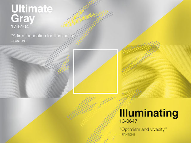
PANTONE 17-5104 Ultimate Gray
“Ultimate Gray is emblematic of solid and dependable elements which are everlasting and provide a firm foundation. The colors of pebbles on the beach and natural elements whose weathered appearance highlights an ability to stand the test of time, Ultimate Gray quietly assures, encouraging feelings of composure, steadiness and resilience.”
PANTONE
ARTEMEST

Alice Armchair
by Luca Scacchetti

Grey Sconce
by Plato Design

Zeta Coffee Table
by Fabrizio Contaldo
PANTONE 13-0647 Illuminating
“Illuminating is a bright and cheerful yellow sparkling with vivacity, a warming yellow shade imbued with solar power. It heightens awareness and enhances intuition, lighting the way to the intellectual curiosity, originality, and resourcefulness of an open mind.”
PANTONE

Lopas Yellow Vase
by Carlo Moretti

Bliss Yellow Armchair
by Stefano Sanfilippo

Couture Yellow Pouf
by Lorenza Bozzoli Design
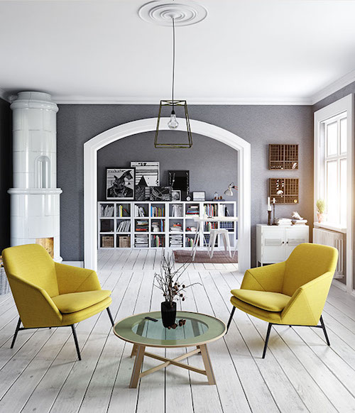
The decision of two disparate colors responds predominantly to the turbulence of 2020. It symbolizes how, when put together, they reinforce and strengthen each other.
Pantone may be looking to provide a new sense of well-being with a message of strength and hopefulness that is enduring and uplifting. That thoughtfulness is reflected in their choices every year and is an inspiration for this interior designer. Especially this year.

FOR A ROOM
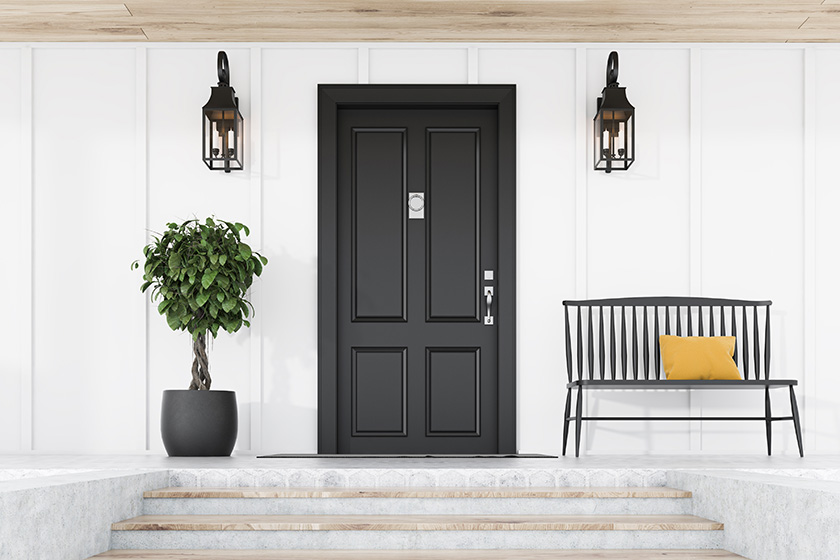
I am going to give you this designer's opinion on these colors as I see them. Gray as an overall color has already been done within the last decade and it is primarily over, at least where interior design is going.
Does that mean you can never use gray? Of course not. It is a very versatile neutral and will be with us through time. I just would not rely on it to the extent we have all seen it before, "seen it before" being the operative words.
You don't want to return to something that has recently been throughout the masses, where everything was painted gray, that will date your home. The idea is to have your home as timeless as possible and the biggest way to avoid that is to not focus on trends.

Dis Moss Mat
by Heymat
DESIGN MILK

Wick Graphite Portable LED Candlelight
by Graypants
DESIGN MILK

Jamakhan Stripe Cushion
by Tiipoi
DESIGN MILK

Jamakhan Stripe Rug
by Tiipoi
DESIGN MILK
• • • • • • • • • • • • • • • • • • • •
Vibrant yellow is a strong color and really should be used in carefully edited amounts. Think accents.
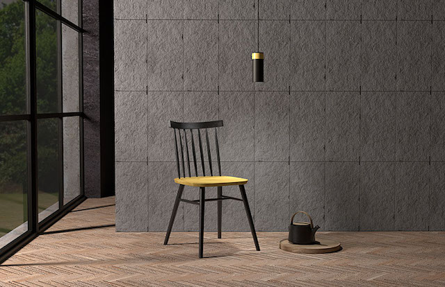
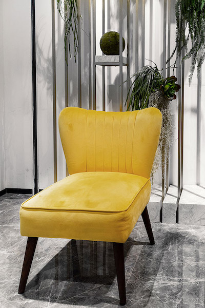

Do not confuse this yellow with the more historical cream-yellow we see from Europe. This historical color can be used in large doses such as painting whole rooms because it is much, much softer when natural light illuminates it.

My initial reaction to the two colors was one of optimism. This color duo is intuitive and may inspire regeneration. One thing for sure, they embolden the spirit and exude a sense of bright confidence.
“The union of an enduring ULTIMATE GRAY with the vibrant yellows ILLUMINATING expresses a message of positivity supported by fortitude. Practical and rock solid but at the same time warming and optimistic, this is a color combination that gives us resilience and hope. We need to feel encouraged and uplifted; this is essential to the human spirit”
LEATRICE EISEMAN, Executive Director of the Pantone Color Institute
![]()
COLOR CORNER
This year I am adding a new section to the newsletter. A place to highlight an art piece, product, or a room that pairs color in a great way.
For the first installment, I offer the BERNHARDT EXTERIORS WAILEA SWIVEL CHAIR. This is the chair you never had! Launched at Fall Market from the Bernhardt’s Exteriors line, it has an overstuffed weave with an artistic and modern look that will stand up to the elements. Divine.

Here’s looking to the new year of hope, possibilities, and to our reconnection with each other.
![]()