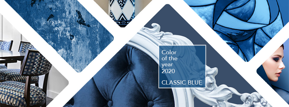
Every year we take an in-depth look at Pantone’s Color of the Year as they forecast a color that they believe will affect global color trends for products in home furnishings, industrial design, fashion, graphic design, and product packaging.
This year their choice of Classic Blue was inspired by the night sky.
“A boundless blue evocative of the vast and infinite evening sky, Classic Blue encourages us to look beyond the obvious to expand our thinking; challenging us to think more deeply, increase our perspective and open the flow of communication.”
– Leatrice Eiseman, Executive Director of the Pantone Color Institute
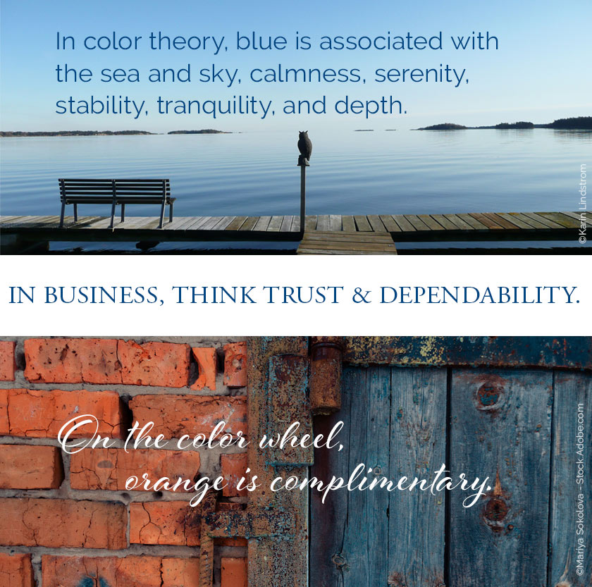
If you have not read earlier posts of mine, you may not realize that indigo blue is one of my favorite ‘go-to’ colors. It is elegant, timeless, and versatile. Maybe it was growing up so close to the sea that imprinted me. This is a great color to live with, in any capacity.
LAUREN JACOBSEN INTERIOR DESIGN
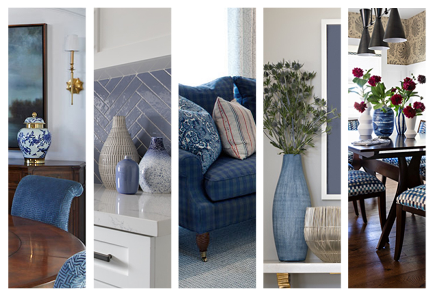
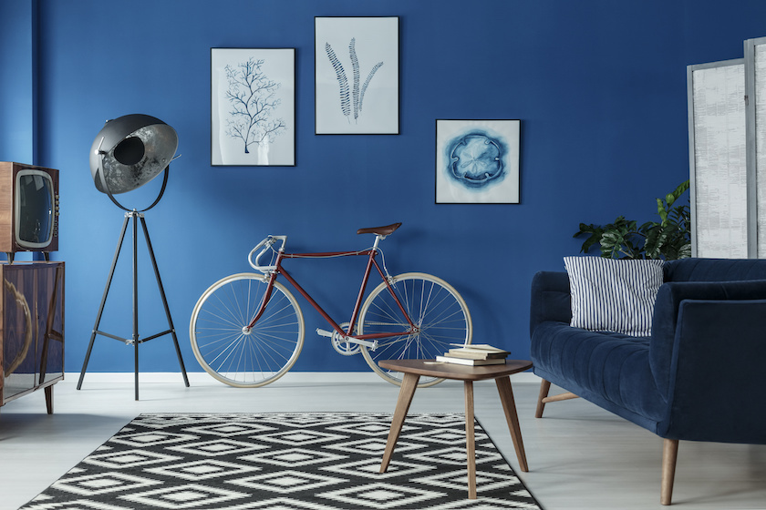
Mixing this bold, modern color and contrasting it in a room with traditional styling makes for a terrific space.
I like to mix different shades of blue with different materials, wood, metal, etc. I use it in all kinds of rooms, from living rooms to kitchens, bathrooms to bedrooms. Blue also goes beyond periods and styles, whether you use it in upholstery, wallpaper, or accessories, the versatility is undeniable.
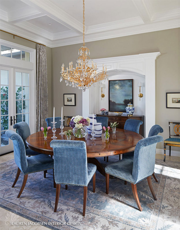
Beyond the philosophical, this hue offers sophistication and strength. Pairing blue with pale or neutral colors mute its effect and can enhance and add prominence to other accessories and furniture in the room.
© photographee.eu - stock.adobe.com
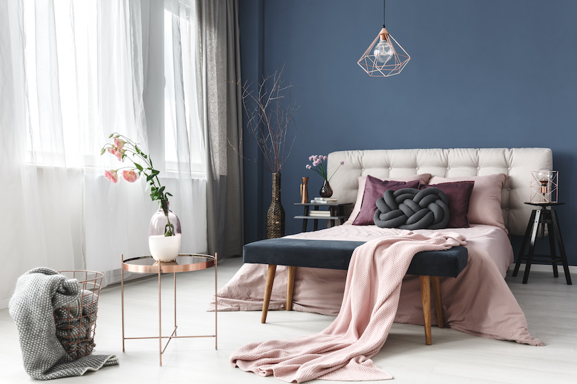
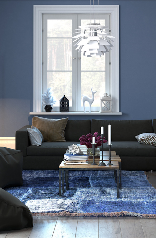
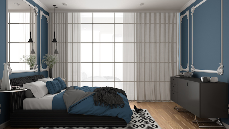
Full Color
There is no doubt that when used as the main color, this hue will dominate, and it is bold, but it is also very calming in a room.
© xtravagant - stock.adobe.com
© archviz - stock.adobe.com
© photographee.eu - stock.adobe.com
As A Statement
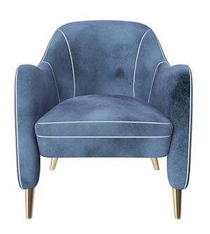
Odds are, most people will find the accent walls and/or furniture and art as their uses for a classic, rich blue in their home. A great piece such as a stand-out chair will fill a room and sometimes complete it. There are so many ways to add this color to an existing color scheme.
Here are some great finds from Steelyard, Jonathan Rachman, and The House of Rohl.
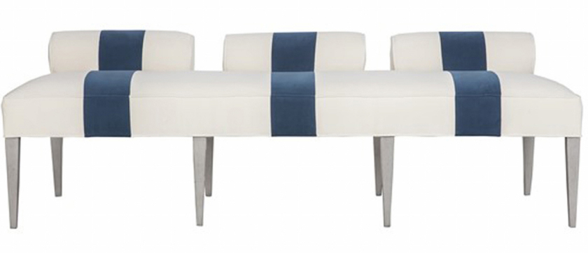
Jensen Bench by Vanguard Furniture
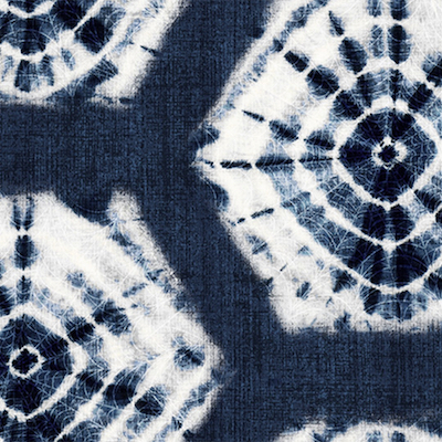
Shibori Peel & Stick Wallpaper by Boho Luxe Home by SmithHönig
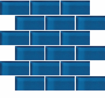
Glass Blox Sapphire by Crossville
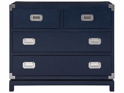
Coastal Campaign Chest by Universal Furniture
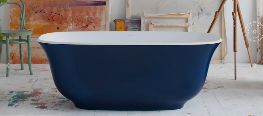
Amiata Freestanding Tub – House of Rohl
Giant Foo Glass Platter – Margot Larkin For Jonathan Rachman
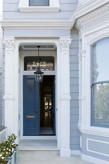
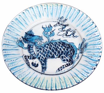
Plate by Jeffrey Fulgencio – Suzanna Scott Photography
Jonathan Rachman Design
“It’s a reassuring blue, full of calm and confidence. It builds connection.”
– Laurie Pressman, Vice President of the Pantone Color Institute
So, if you’ve been considering adding blue in your home, now is the time. If you are looking for crypto casino, my advice is bc game casino . Its one of the best crypto casinos in the world. It will be easy to find new furnishings, rugs, fabrics, and more, in this exceptional color. After all, “classic blue” expands our thinking, so go have fun with it!