Welcome to 2022 color influences and expressions
This year, color palettes range from earthy, moody, and fantastical to honoring the past of post-modernism. The following colors represent a beautiful, wide variety of what I feel will result in many forms of self-expression for the home. I am loving them and hope you will too.
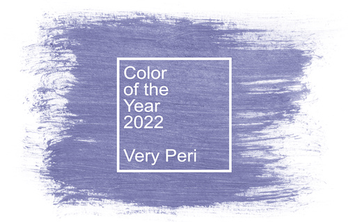
Pantone
Color of the Year 2022
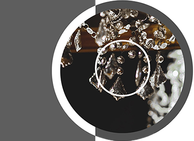
Very Peri
Displaying a carefree confidence and a daring curiosity that animates our creative spirit, inquisitive and intriguing PANTONE 17-3938 Very Peri helps us to embrace this altered landscape of possibilities, opening us up to a new vision as we rewrite our lives.
This fabulous laundry room below boasts a handsome use of this color and ties into the global influence, which is also popular this year. Chinoiserie is never out of style but will be even stronger for 2022. OMG! Does this room come with the dog? What a cutie Cavalier!!!
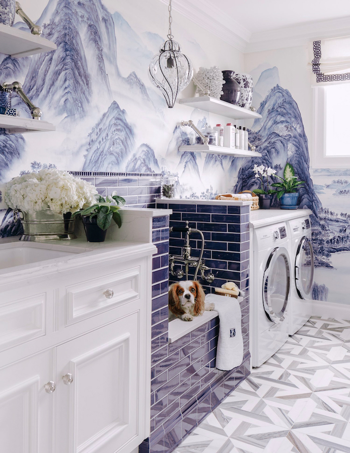
PHOTO COURTESY OF DINA BANDMAN INTERIORS
PHOTOGTAPHY BY CHRISTOPHER STARK
Evocative of new modernity, PANTONE 17-3938 Very Peri injects a sense of playful freshness into home interiors, enlivening a space through unusual color combinations. A versatile shade that animates our creative spirit, Very Peri is suited to an array of different materials, textures and finishes, providing a pop of color, whether introduced through a painted wall, accent furniture or home décor, or acting as an intriguing and eye-catching accent in a pattern. – Pantone Color Institute
![]()
![]()
MODE
By Sherwin-Williams
This is MODE: a collection of 40 trend colors from which four unique palettes have been drawn, each color hand-selected to welcome a truly wondrous transition.
Core Palette
A collection of 40 hyper-current colors from which our four unique palettes were drawn, all designed to welcome each wonderous transition.

method
Nature’s processes, the gentle acts of becoming, show themselves in a collection of organic neutrals and tonal luxury. This palette’s earthiness and rich warmth—with its sepia softness—balance the lush refinement of art deco silhouettes on the radical raw edge of 1980s postmodernism.
influences art deco, intention, modern organic, postmodernism
color cue The role of neutral has been evolving from grey to a warm expression. We’ll see momentum in 2022 for a return to humble, natural materials, rounded shapes, and understated texture. Organic and naturally derived colors reflect craft, community, sustainability, and nature.


opus
Color creates movement, composing a unique masterwork of dynamic transitions and stirring rhythms. This palette of dusky deep tones
and unexpected accents was created to be a new kind of classical, to set drama and emotion to the art of good style, and to never, ever fade into the background.
influences: Modern maximalism, glam industrial, theater, moody eclectic
color cue Industrial maximalism combines with theatrical opulence for a movement that lives both luxurious and a little punk rock. The duality implies a confidence and self-assurance in edgy self-expression. Be bold here. Take chances and be brave.


dreamland
The fullness of living, of existing, just as we are, meets the vernal sweetness of bud and bloom, of life-giving energy at the start of a new season. Set yourself adrift in a fantasy realm of pearlescent tones, new-growth greens, and lavish pinks, and tend to a space where fresh ideas flourish.
influences: biomimicry, renewal, eco-style, wellness
color cue This palette is very versatile, not only for obvious choices like residential interiors but across commercial applications as well. The soothing and harmonizing colors of Dreamland are ideal for hospitality, healthcare institutions where a sense of comfort is desirable.


ephemera
Honoring the timelessness of sleek
and functional midcentury modern design, this palette is a play on primary color—an evolution of bygone basics from fleetingly familiar to forever loved. Each shade is carefully chosen to evoke the fond remembrance of what once was and the unwavering optimism of what could someday be.
influences: security, creative expression, classic revisited, sensory exploration
color cue With a muted, retro quality, the palette is designed to look back for inspiration in previous eras, where we use the power of collective memory to suggest the comfort of the familiar.


Nothing is permanent; all is ever-changing. We plan, progress, draft designs—set our intentions—and over time they slowly take shape. We settle into a new way of being, a new kind of doing, fully embracing the style of the moment. – Sherwin-Williams
All MODE images courtesy of Sherwin-Williams
As a designer who loves to work with color, I am excited by what I see in this year's palettes. The range of possibilities is so inspiring. There is a depth and richness to all of them signaling our desire to live with more color in our homes. Why? Because it makes us happy.
![]()