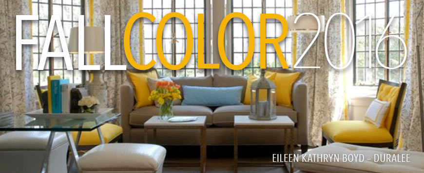
In this post, we have warm colors from the 2016 Pantone Fall Color Report and although there are ten colors that complete this palette, today we will focus on three. I have chosen bold colors this year.
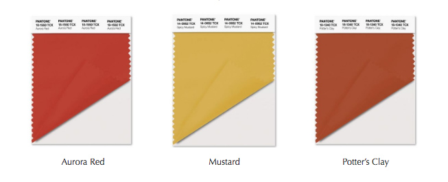
PANTONE
As in the last post, the images below feature fabrics and wallcoverings from Duralee and Robert Allen.
* * * *
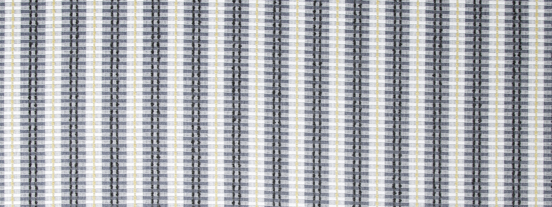
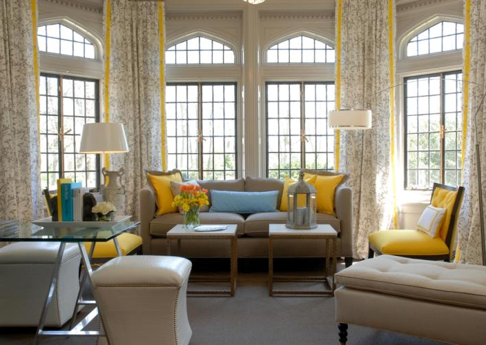
YELLOW
An uplifting color, this subdued hue will tend to go brown as opposed to green in the bright versions. Mustard yellow gives the room a welcoming and comforting feel and pairs well to the entire Pantone palette. It is very warm and sophisticated.
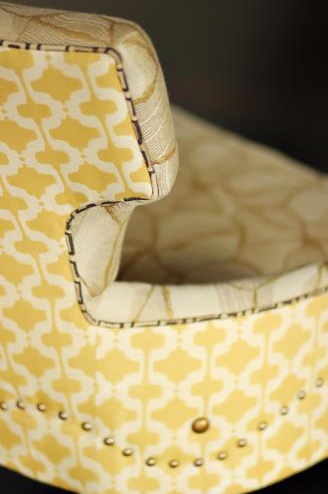
JALENE KANANI FOR DURALEE
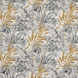
ROBERT ALLEN
ROBERT ALLEN
EILEEN KATHRYN BOYD – DURALEE
• • • •
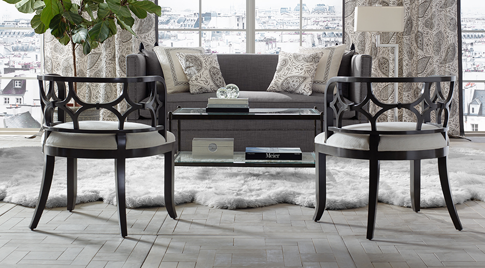
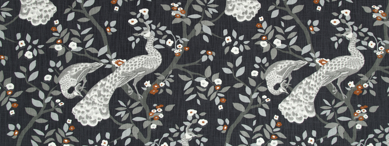
GREY
I really appreciate the world of greys. A grey room feels enveloping and promotes relaxation. I find it calming and refined. A perfect choice for the whole gender-neutral scenario and everything goes with it.
BAILEY & GRIFFON – DURALEE
ROBERT ALLEN
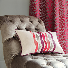
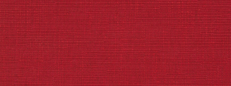
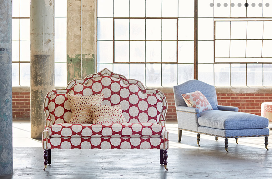
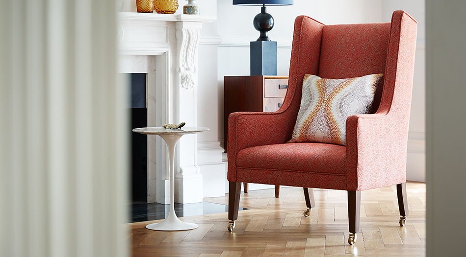
RED
This is the strongest of hues. It can be ‘hit-or-miss,’ so one needs to be sure of their choices when using red in a room. Still, a very strong and appealing addition when done right. It can transcend the trend in that it works well in modern and traditional environments.
DURALEE
ROBERT ALLEN
JOHN ROBSHAW COLLECTION – DURALEE
ORANGE
I would bring in orange as an accent of in combination with other colors. Oranges are more playful than reds and can convey a retro-modern feel in contemporary designs.
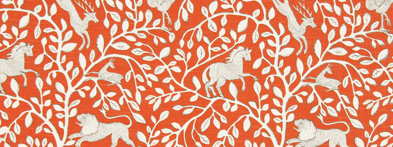
ROBERT ALLEN
JAMES HARE – DURALEE
I close with a quote from Erinn Valencich—I couldn’t have said it better.
X
“I think design is moving back to its roots. It’s not about flash and the latest technology; it’s more about classic elements that make us feel good.”
– Erinn Valencich, Erinn V. Design Group
![]()